Nagari Typeface Design
Devanagari (Deva - God, Nagari - City) is a major script used in India, and East & South East Asia. Devanagari’s origins date back to the 1st century CE. More than 120 languages are based on it, with the prominent ones being Sanskrit and Hindi. This makes it one of the most adopted writing systems in the world.
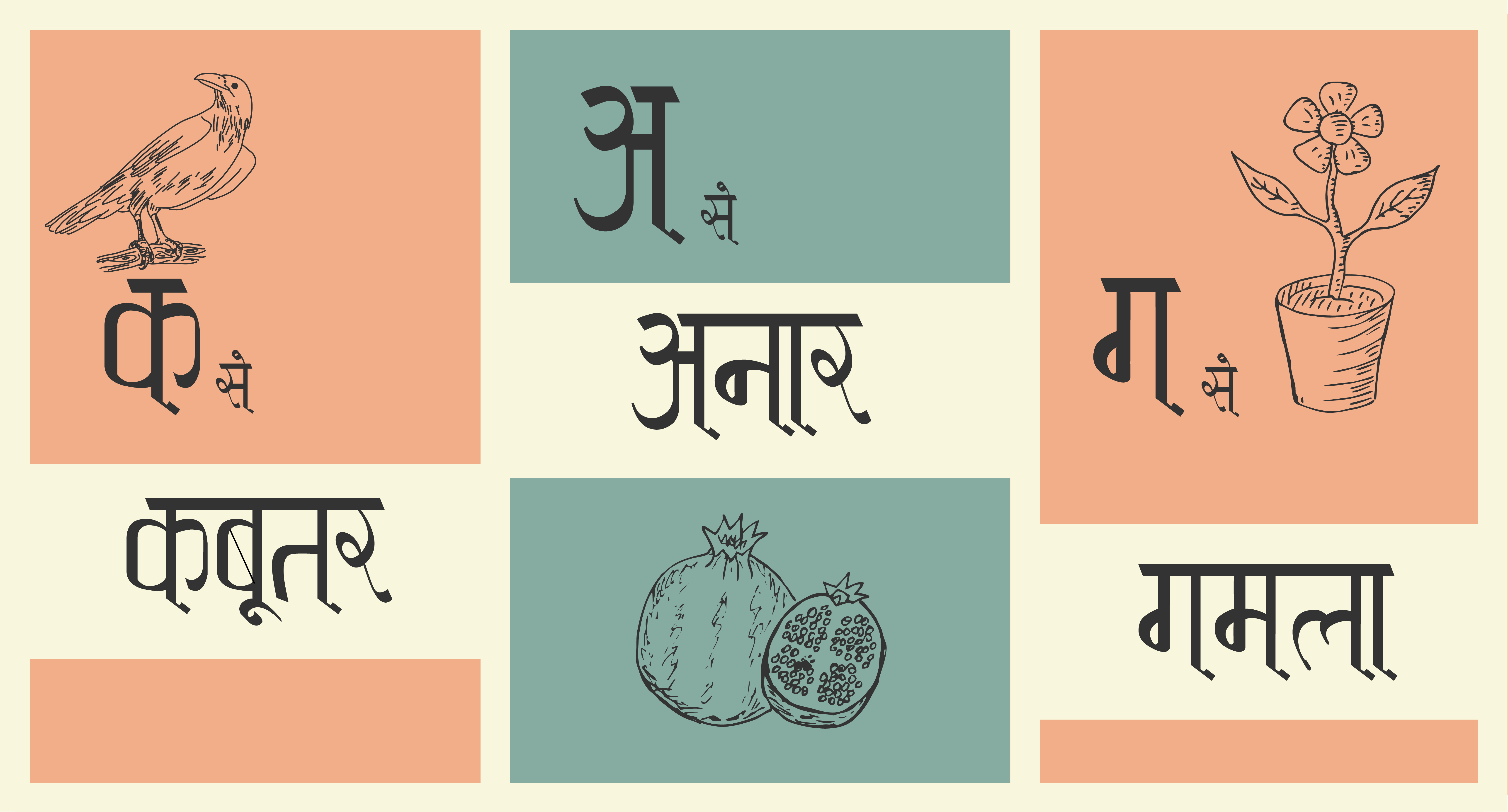
I designed the Nagari typeface based on inspirations from the old manuscripts found in India. I wanted to explore how one script can be written in different styles and different languages. This typeface is an attempt to combine the modern and tradional aspects of the script.
Its primary use case is as a headline font, to be used on book covers, newspapers, hoardings, etc.
The structure of the script
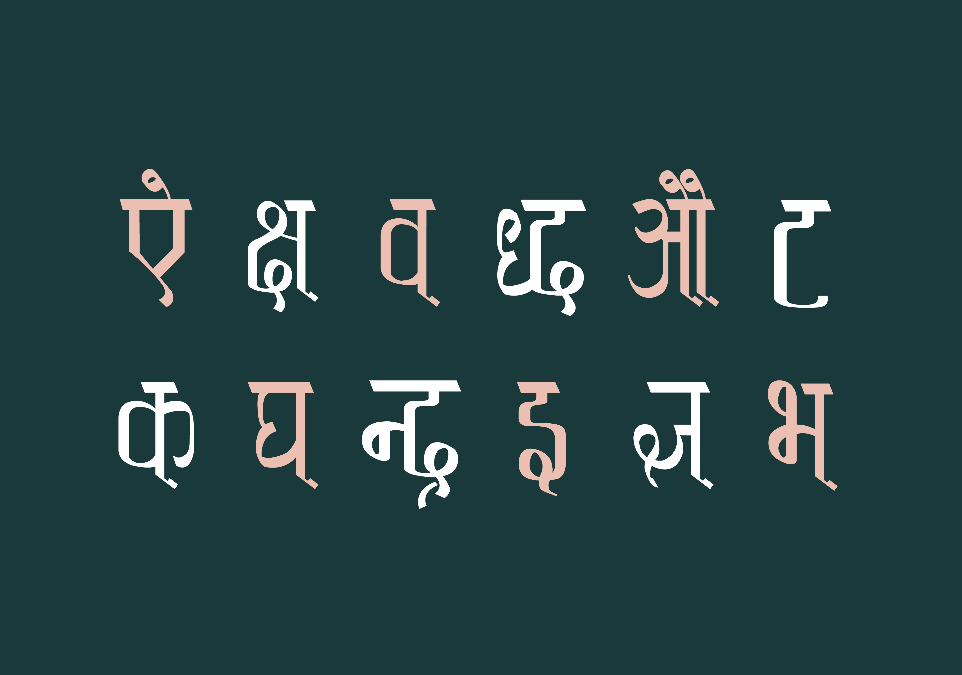
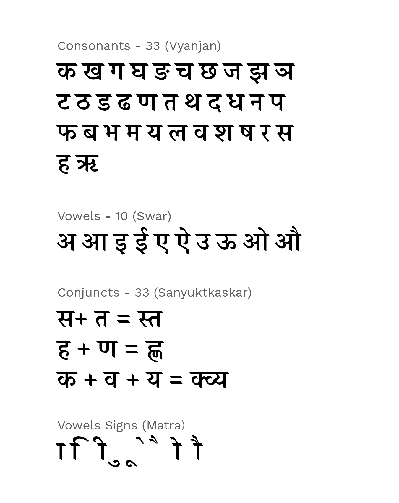
Devanagari has 43 basic primary characters, comprising 10 vowels and 33 consonants. By combining the 33 consonants in groups of two, three, or four, more than 300 forms of conjunctions can be produced.
Characteristics of the Script
I started the project by developing an understanding of some basic but defining features of the script:
- A continous head line bar, which is used above all letters, also denotes the end and begining of a new word
- Every letter has atleast one straight stroke
- Every letter has atleast one right angle near the headline
- Every letter has atleast one break
- Every letter has a curve, cirle or a loop
- A few extend in height while a few extend in width
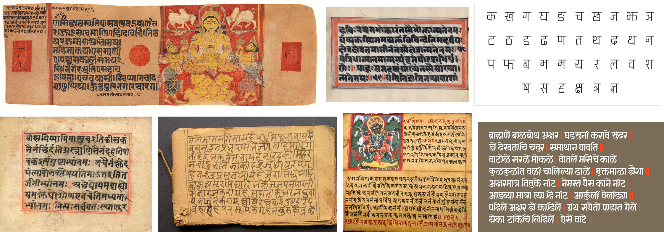
Finding my Inspiration
I began collecting my inspirations for the typeface, ranging from old manuscripts going back 3000 years all the way upto current typefaces. A range of different styles, strokes, weights and angles of Devangari calligraphy can be seen throughout these inspirations along with their evolution over the years.
INTERVIEW WITH YASHODEEP GHOLAP, TYPE DESIGNER
As part of my reseach, I conducted an interview with an experienced Devanagari type designer, Yashodeep Gholap, based in Mumbai, India. The main purpose was to understand the scope, guidelines and techniques to be used as part of understanding the form of the script, which would help me in finding a direction.
EXPLORATIONS - 1
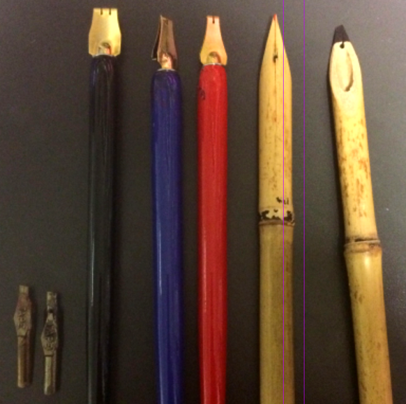
Writing Pen
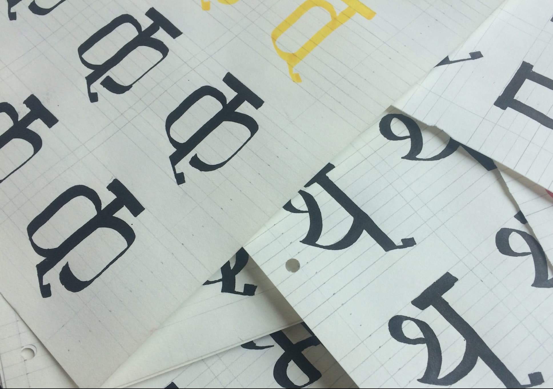
Devanagari was traditionally written with bamboo reed pens, which are cut at particular angles to achieve the specific look of the script. To bring authencity to the script and its form, I wrote letters using the reed pen on the grid. Working with the pen was difficult due to its fragility and the limited resources.
I diverted to experimenting with more modern means using flat metallic nibs of various widths and Roman angular nibs which would still give me the freedom to keep the traditional free flowing forms. The flat metallic nibs gave the best results so I proceeded with them.
Grid Structure
Unlike Latin, Devanagari has no specifications for type building.
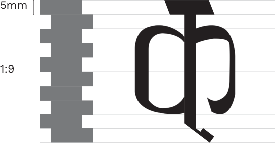
The height of the letters depend upon the width of the pen being used. The average x-height of the letters can be at a ratio of 1:7, depending on the pen width. To decide the average ratio for type build, I used different pen widths to see what would be the perfect ratio in relationship to the pen.
After several iterations on the grid, I finalised upon a 1:9 ratio with the thickness of the pen at 5 mm.
EXPLORATIONS - 2
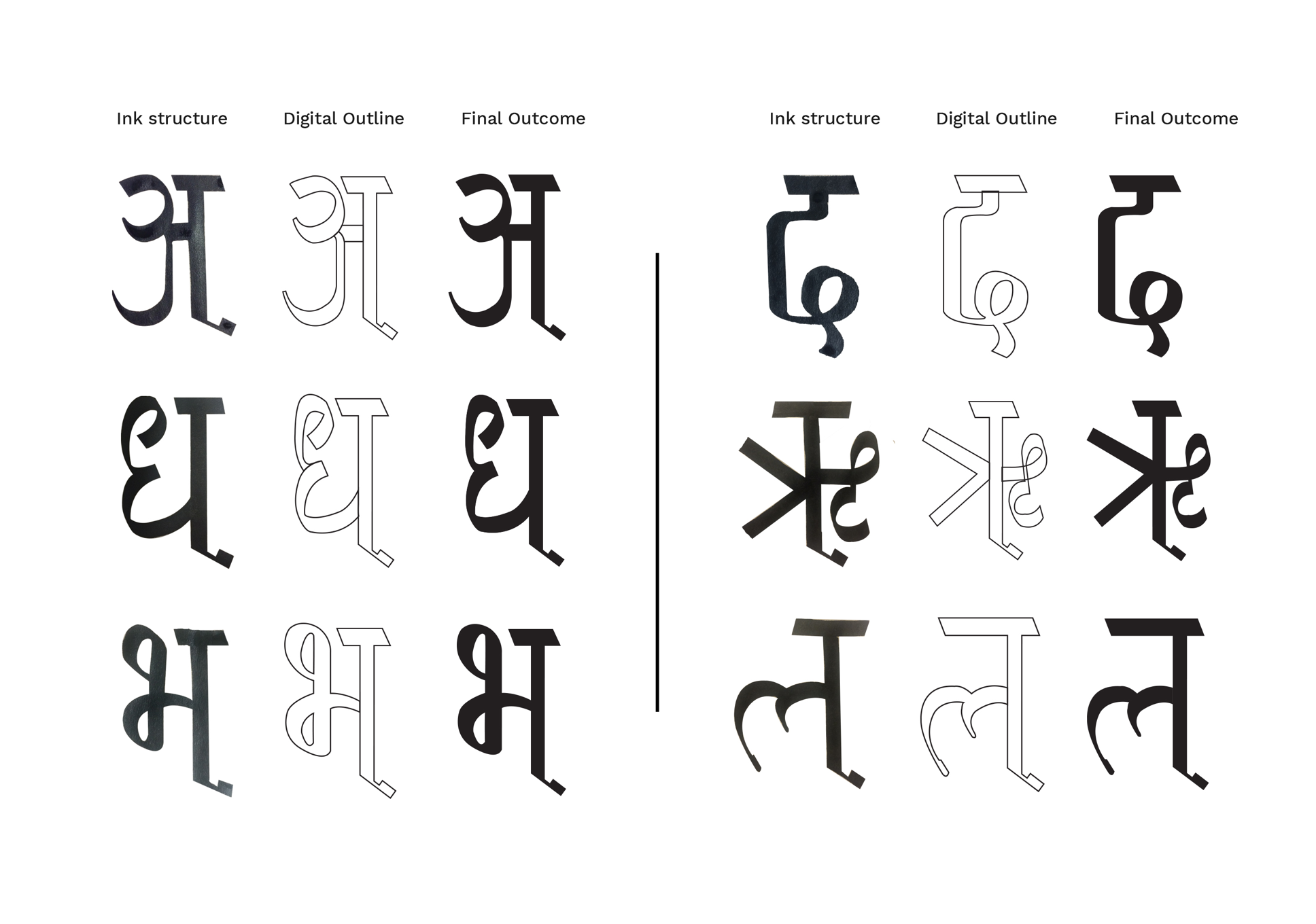
Analog to Digital
With the grid finalized, I experimented with various letter heights, weights, and characteristics within the grid line. The explorations made were keeping in mind the traditional and the modern alterations to the script.
Throughout the process, I digitised multiple fonts to develop a holistic view. Once the style was finalised, I moved towards digitalising the concept and creating the 33 consonants.
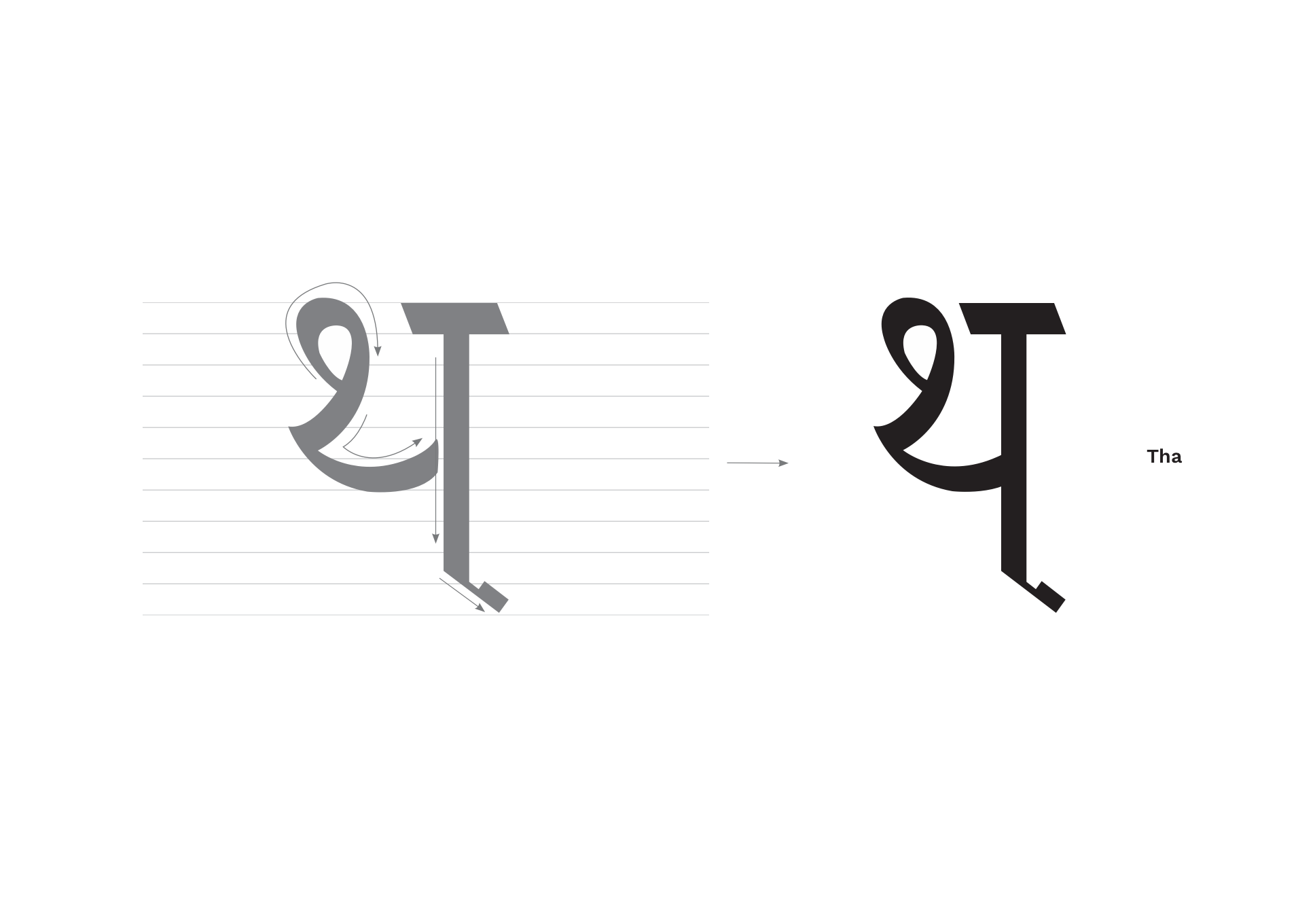
Final Outcome
I chose the 1:9 grid to give the script a more elongated feel to its characters. The traditional extension line used in older manuscripts is present below the characters with some modifications. The script also makes use of square-ish edges to differentiate itself from other Devanagari scripts.
Learnings
The project is still a work in progress. This first version was completed in 3 months with basic characters. I wish to further complete all the variables and develop this font into an OTF / TTF typeface.
1. Research, Design, Iterate & Stop!
One of the issues I kept facing was being stuck in a rut and going around in circles with multiple variations to find the correct representation for the font. Though the iteration process helps in finding variations, I realized it is important to stop and digitalize with a few concepts to see how further they can be expanded. This helps in minimizing options early on with an understanding of what aspects would work and which would not.