Classic Scooters
Editorial Re-design
The author Mike Webster in 1997 published Classic Scooters, a comprehensive collection of over 30 rare and classic scooters from around the globe, capturing their history, make, and specifications. For my Editorial Design course at Prague College, I chose Classic Scooters for a redesign project.
I restructured the presentation of the scooters to reflect their place in the era of their popularity. I put greater emphasis on the evolution of technology and engineering by highlighting the technical aspects in a way that complemented the vintage imagery of the original design.
YEAR
April - June 2016
SERVICE
Editorial design
Book binding
MY ROLE
I was responsible for the conceptulization, editorial re-design, and binding of the book.
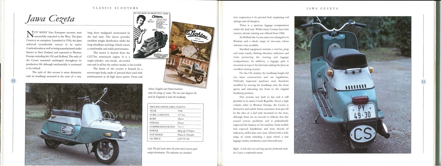
The original book design - Classic Scooters, 1997
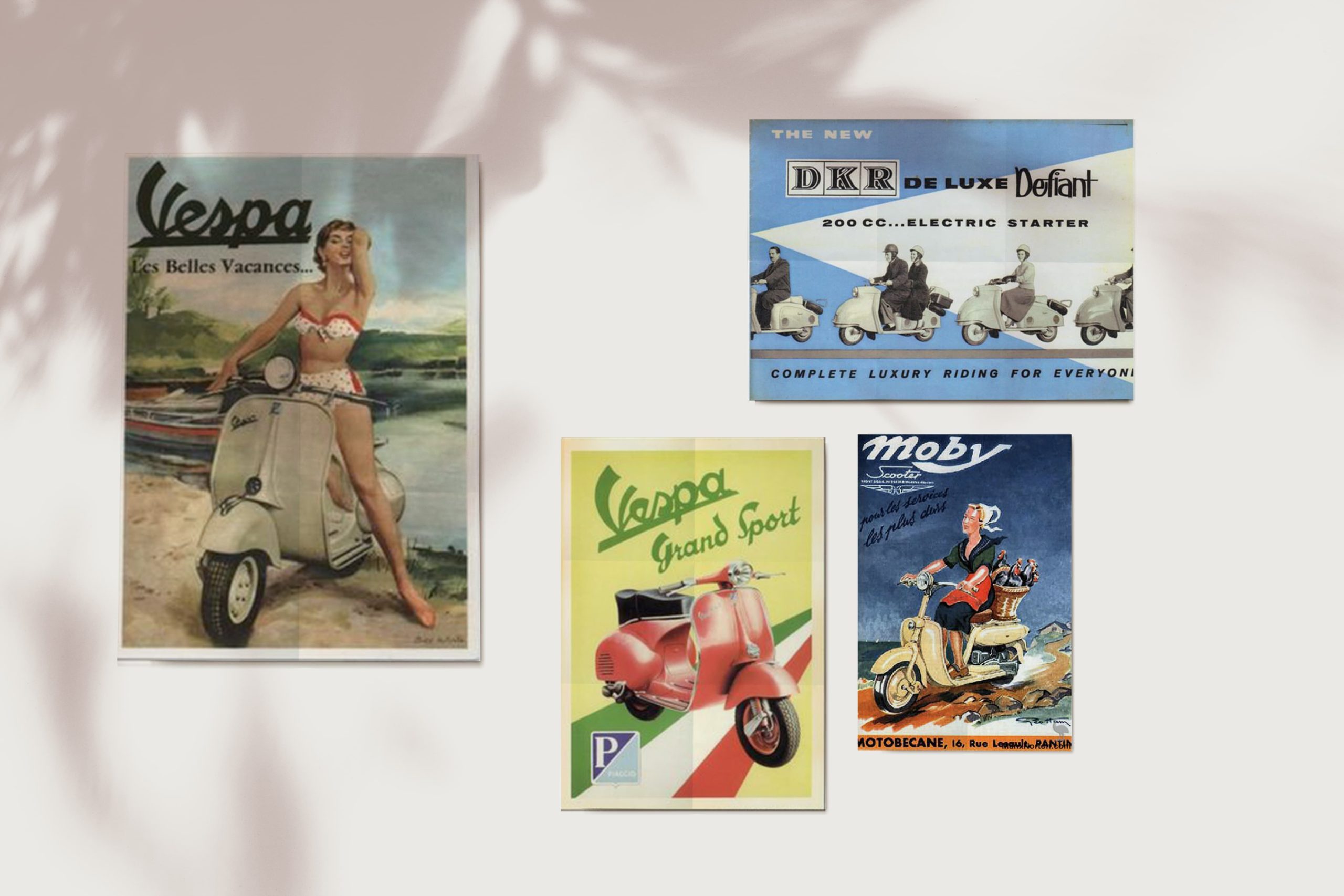
The redesigned book cover was inspired by posters created specially for promoting the scooters in their respective eras. I found these original posters depicted the beauty and timelessness of the vehicles quite well and thus strove to recreate the same in my work.
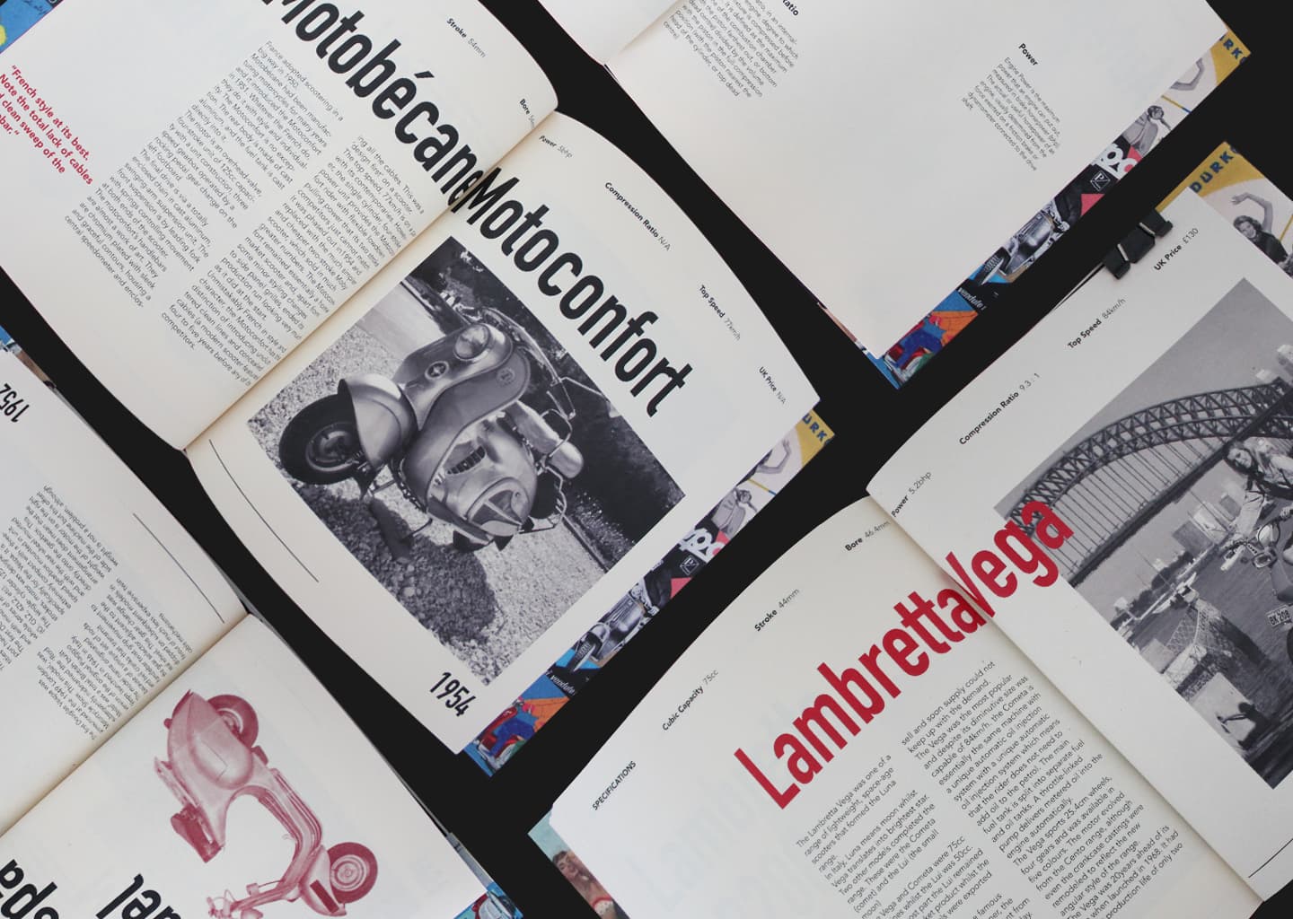
To allow the imagery in the book to do most of the talking, I reduced the palette to just two colors — black and red, a popular color in some eras of industrial scooter design. A reduced type palette, consisting of the skinny DIN Alternate and the round and wide sans serif Avenir, added to a cohesive experience.
Finally, I dropped the traditional pagination system throughout the original book in favor of a progress bar to indicate the chronological evolution of the scooters.